Glints Mobile App
The background behind this research and evaluation is I am one of Glints’ loyal user. I use Glints every time I became a jobseeker. But anyway, so Glints is one of the most popular job portal now, especially in Asia with their Unique Selling Point that is their chat feature that allows Jobseekers to having a convo with Employers. But as a user that understand about digital product, I feel like there is some thing that can be improved from this app. Most of them are the usability and how their design match real world case. So.. let’s take a look at my heuristic evaluation result.
A. What is heuristic evaluation
Heuristic evaluation (Nielsen and Molich, 1990; Nielsen 1994) is a usability engineering method for finding the usability problems in a user interface design so that they can be attended to as part of an iterative design process. Heuristic evaluation involves having a small set of evaluators examine the interface and judge its compliance with recognized usability principles (the "heuristics").

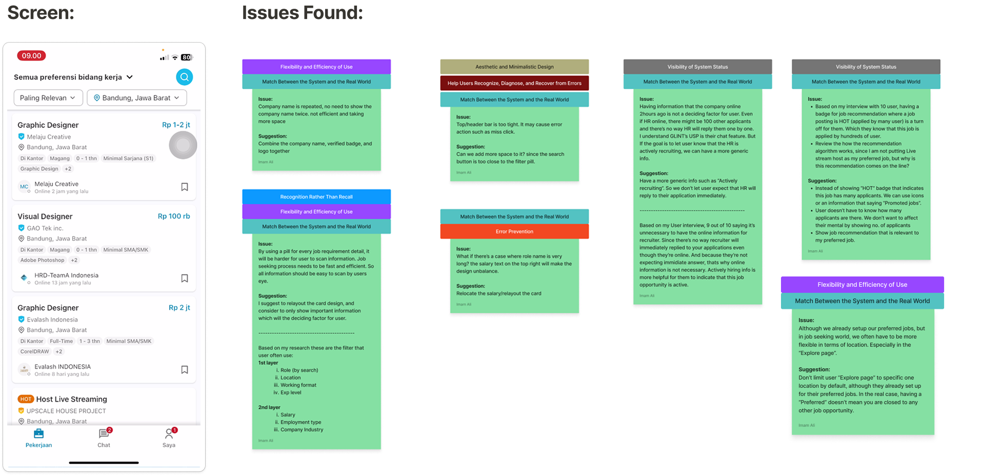
Now I will spot some usability principles based on 10 principles above for every page.
Home page

Inconsistent header back icon

Pre-search screen


Post-search screen


Filter


Detail Page


Chat room & Template message


Create cover letter by AI


Profile Page


Glints profile update


Okay, that's all for the heuristic evaluation with page redesign. Here's some other evaluation.


